Introduction
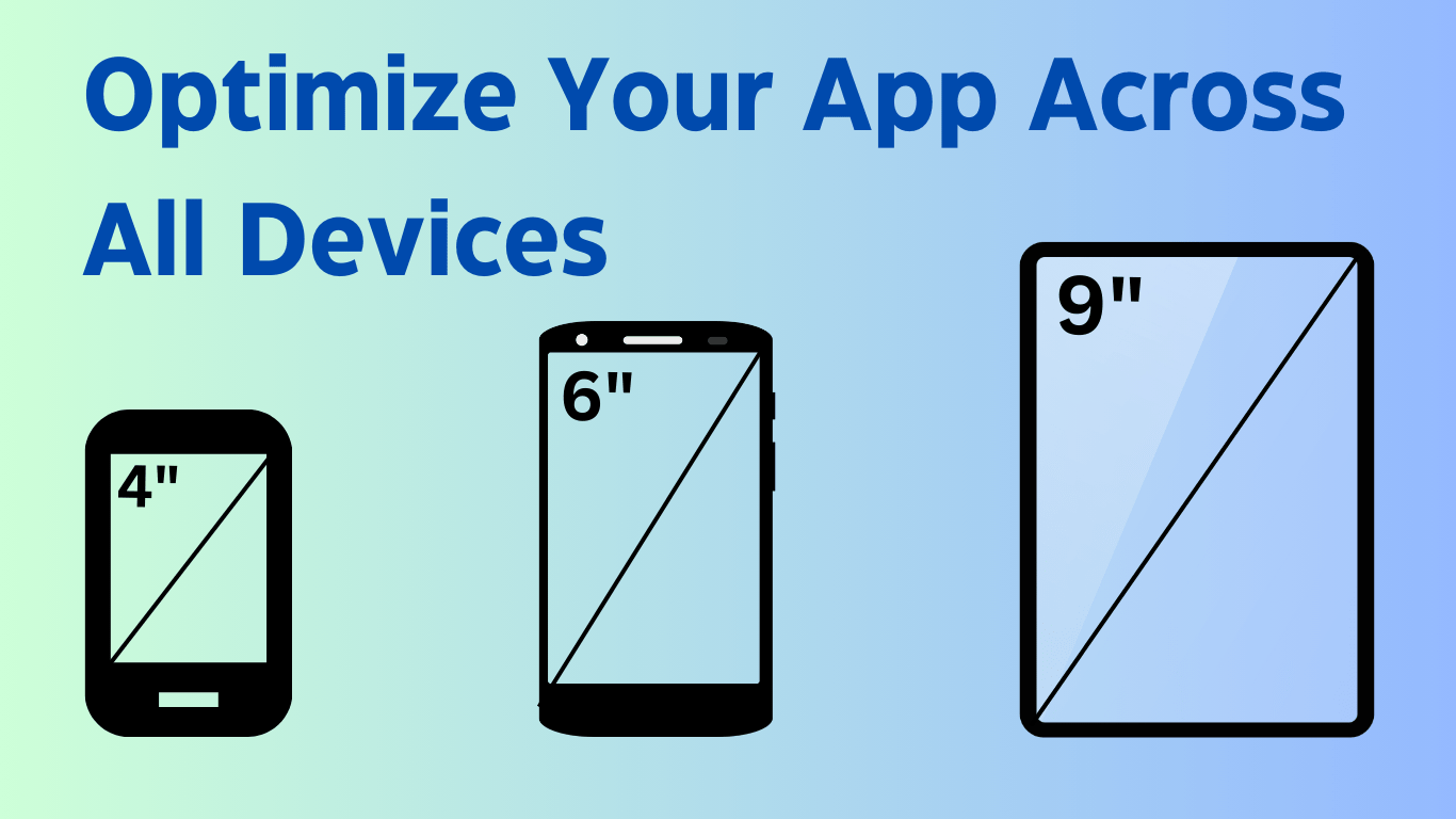
In today’s tech world, devices have screen sizes from 6 inch smartphone to 10 inch tablets or maybe foldable phones which has both kind. It’s crucial and important to make apps that can run on all screen sizes, so wide range of users can use your apps. It is not necessary that apps we develop should be the same on every screen size. We have to add some functionalities to do that.
In this article I’m going to show you how you can make your UI more reponsive.
Why Responsive and Adaptive Design Matters
The digital world is populated with a wide range of devices, each featuring different screen sizes and capabilities. From compact screen of mobile to the larger displays of tablets and desktops via ChromeOS, every device offers a unique canvas for app interaction. Responsive design means creating an app that adapts these screen sizes and react differently, ensuring that functionalities will be preserved.
What is window size classes?
Windows Size Classes are predefined breakpoints that categorize the available display are into compact, medium and expanded widths and heights. Although both dimensions are necessary, but width plays a crucial role due to vertical scrolling in most apps.
Compact Width: Ideal for devices less that 600dp, almost all phones in portrait mode comes under this.
Medium Width: Ranges 600dp ≤ width < 840dp, suitable for tablets.
Expanded Width: Ranges width ≥ 840dp, suitable for tablets in landscape orientation and landscape mode and larger foldable phones.
Implementation
Creating Windows Size Classes
In Windows Size Class there will be two classes:
Data Class (WindowSize) that will have two properties width and height, both of type WindowSize stores information about the width and height of a window, classifying each as either Compact, Medium or Expanded.
Enum Class (WindowType) that defines three states for window dimensions: Compact, Medium and Expanded. These are the states used to categorize the size of a screen based of specific breakpoints.
Composable function (rememberWindowSize): It takes width and height of data class and returns WindowType whether it is Compact, Medium or Expanded.
Design Screens
I have created two classes where I have created composables:
ProfileActivity:
It uses rememberWindowSize() function get the window size and choose which composable to call, CompactProfileScreen() for standard smartphones screens and MediumToExpandedProfileScreen() for medium to expanded screens.
It has two composable methods CompactProfileScreen() and MediumToExpandedProfileScreen() which will show our data in two different ways:
- CompactProfileScreen: Displays user information in a vertical format, suitable for standard screens. It includes a profile picture, and text fields for name, email, and gender.
- MediumToExpandedProfileScreen: Displays user information in a row layout where the profile picture and user details (name, email, gender) are arranged horizontally, good for wider screens.
ItemActivity:
It also gets the window size from rememberWindowSize() function and it selects the appropriate UI layout for displaying items. There are two composable to show data in two different ways:
- CompactItemsScreen: This layout utilizes a LazyColumn to display items vertically. Each item is showcased within a styled box that includes padding and rounded corners.
- MediumToExpandedItemsScreen: Suitable for medium to larger screens, this layout shows data in LazyVerticalGrid that adjusts the number of columns based on the screen width.
Code:
WindowSize.kt
package com.ghanshyam.multiscreen

import androidx.compose.runtime.Composable
import androidx.compose.ui.platform.LocalConfiguration

data class WindowSize(
    val width: WindowType,
    val height: WindowType
)

enum class WindowType {
    Compact, Medium, Expanded
}

@Composable
fun rememberWindowSize(): WindowSize {
    val configuration = LocalConfiguration.current
    return WindowSize(
        width = when {
            configuration.screenWidthDp < 600 -> WindowType.Compact
            configuration.screenWidthDp < 840 -> WindowType.Medium
            else -> WindowType.Expanded
        },
        height = when {
            configuration.screenHeightDp < 480 -> WindowType.Compact
            configuration.screenHeightDp < 900 -> WindowType.Medium
            else -> WindowType.Expanded
        }
    )
}
ProfileActivity.kt
package com.ghanshyam.multiscreen

import androidx.compose.foundation.background
import androidx.compose.foundation.layout.Box
import androidx.compose.foundation.layout.Column
import androidx.compose.foundation.layout.Row
import androidx.compose.foundation.layout.Spacer
import androidx.compose.foundation.layout.fillMaxSize
import androidx.compose.foundation.layout.fillMaxWidth
import androidx.compose.foundation.layout.height
import androidx.compose.foundation.layout.padding
import androidx.compose.foundation.layout.size
import androidx.compose.foundation.layout.width
import androidx.compose.foundation.rememberScrollState
import androidx.compose.foundation.shape.RoundedCornerShape
import androidx.compose.foundation.verticalScroll
import androidx.compose.material3.MaterialTheme
import androidx.compose.material3.Text
import androidx.compose.runtime.Composable
import androidx.compose.ui.Alignment
import androidx.compose.ui.Modifier
import androidx.compose.ui.draw.alpha
import androidx.compose.ui.draw.clip
import androidx.compose.ui.text.font.FontWeight
import androidx.compose.ui.tooling.preview.Preview
import androidx.compose.ui.unit.dp
import androidx.compose.ui.unit.sp

@Preview(showSystemUi = true)
@Composable
fun ProfileScreen(){
    val windowSize = rememberWindowSize()
    when (windowSize.width) {
        WindowType.Compact -> {
            CompactProfileScreen()
        }
        else -> {
            MediumToExpandedProfileScreen()
        }
    }
}

@Composable
fun CompactProfileScreen() {
    Column(
        modifier = Modifier
            .fillMaxSize()
            .verticalScroll(rememberScrollState())
            .padding(horizontal = 32.dp)
    )
    {
        Spacer(modifier = Modifier.height(36.dp))
        Box(
            modifier = Modifier
                .clip(RoundedCornerShape(2.dp))
                .size(180.dp)
                .background(MaterialTheme.colorScheme.primary)
                .align(Alignment.CenterHorizontally)
        )
        {
            Text(
                modifier = Modifier.align(Alignment.Center),
                text = "G",
                color = MaterialTheme.colorScheme.onPrimary,
                fontSize = 80.sp
            )
        }
        Spacer(modifier = Modifier.height(64.dp))

        UserInfo(
            title = "Name",
            content = "Ghanshyam"
        )

        UserInfo(
            title = "Email",
            content = "example@gmail.com"
        )

        UserInfo(
            title = "Gender",
            content = "Male"
        )
    }
}

@Composable
fun UserInfo(
    title: String,
    content: String
) {
    Column {
        Text(
            modifier = Modifier.alpha(0.7f),
            text = title,
            color = MaterialTheme.colorScheme.onBackground,
            fontSize = 16.sp,
            fontWeight = FontWeight.SemiBold
        )
        Text(
            modifier = Modifier.alpha(0.7f),
            text = content,
            color = MaterialTheme.colorScheme.onBackground,
            fontSize = 16.sp,
        )
        Spacer(modifier = Modifier.height(32.dp))
    }
}

@Composable
fun MediumToExpandedProfileScreen() {
    Column(
        modifier = Modifier
            .fillMaxSize()
            .verticalScroll(rememberScrollState())
            .padding(horizontal = 32.dp)
    )
    {
        Spacer(modifier = Modifier.height(36.dp))

        Row(modifier = Modifier.fillMaxWidth(),
            verticalAlignment = Alignment.CenterVertically
            ){
            Box(
                modifier = Modifier
                    .clip(RoundedCornerShape(2.dp))
                    .size(180.dp)
                    .background(MaterialTheme.colorScheme.primary)
            )
            {
                Text(
                    modifier = Modifier.align(Alignment.Center),
                    text = "G",
                    color = MaterialTheme.colorScheme.onPrimary,
                    fontSize = 80.sp
                )
            }
            Spacer(modifier = Modifier.width(100.dp))

            Column {
                UserInfo(
                    title = "Name",
                    content = "Ghanshyam"
                )

                UserInfo(
                    title = "Email",
                    content = "example@gmail.com"
                )

                UserInfo(
                    title = "Gender",
                    content = "Male"
                )
            }


        }

    }
}
ItemActitivty.kt
package com.ghanshyam.multiscreen

import androidx.compose.foundation.background
import androidx.compose.foundation.layout.Box
import androidx.compose.foundation.layout.fillMaxSize
import androidx.compose.foundation.layout.fillMaxWidth
import androidx.compose.foundation.layout.height
import androidx.compose.foundation.layout.padding
import androidx.compose.foundation.lazy.LazyColumn
import androidx.compose.foundation.lazy.grid.GridCells
import androidx.compose.foundation.lazy.grid.LazyVerticalGrid
import androidx.compose.foundation.shape.RoundedCornerShape
import androidx.compose.material3.MaterialTheme
import androidx.compose.material3.Text
import androidx.compose.runtime.Composable
import androidx.compose.ui.Alignment
import androidx.compose.ui.Modifier
import androidx.compose.ui.draw.clip
import androidx.compose.ui.text.font.FontStyle
import androidx.compose.ui.unit.dp
import androidx.compose.ui.unit.sp

@Composable
fun ItemsScreen() {
    val windowSize = rememberWindowSize()
    when (windowSize.width) {
        WindowType.Compact -> {
            CompactItemsScreen()
        }
        else -> {
        MediumToExpandedItemsScreen()
        }
    }
}

@Composable
fun CompactItemsScreen() {
    LazyColumn(modifier = Modifier.fillMaxSize()) {
        items(40) { index ->
            Box(
                modifier = Modifier
                    .fillMaxWidth()
                    .height(200.dp)
                    .padding(16.dp)
                    .clip(
                        RoundedCornerShape(30.dp)
                    )
                    .background(MaterialTheme.colorScheme.secondaryContainer),
                contentAlignment = Alignment.Center
            ) {
                Text(
                    text = "Item $index",
                    color = MaterialTheme.colorScheme.onSecondaryContainer,
                    fontSize = 20.sp,
                    fontStyle = FontStyle.Italic
                )
            }
        }
    }
}


@Composable
fun MediumToExpandedItemsScreen() {
    LazyVerticalGrid(modifier = Modifier.fillMaxSize(), columns = GridCells.Adaptive(250.dp)) {
        items(40) { index ->
            Box(
                modifier = Modifier
                    .fillMaxWidth()
                    .height(200.dp)
                    .padding(16.dp)
                    .clip(
                        RoundedCornerShape(30.dp)
                    )
                    .background(MaterialTheme.colorScheme.secondaryContainer),
                contentAlignment = Alignment.Center
            ) {
                Text(
                    text = "Item $index",
                    color = MaterialTheme.colorScheme.onSecondaryContainer,
                    fontSize = 20.sp,
                    fontStyle = FontStyle.Italic
                )
            }
        }
    }
}
MainActivity.kt
package com.ghanshyam.multiscreen

import android.os.Bundle
import androidx.activity.ComponentActivity
import androidx.activity.compose.setContent
import androidx.compose.foundation.layout.fillMaxSize
import androidx.compose.material3.MaterialTheme
import androidx.compose.material3.Surface
import androidx.compose.ui.Modifier
import com.ghanshyam.multiscreen.ui.theme.MultiScreenTheme

class MainActivity : ComponentActivity() {
    override fun onCreate(savedInstanceState: Bundle?) {
        super.onCreate(savedInstanceState)
        setContent {
            MultiScreenTheme {
                Surface(
                    modifier = Modifier.fillMaxSize(),
                    color = MaterialTheme.colorScheme.background
                ) {
                    ItemsScreen()
//                    ProfileScreen()
                }
            }
        }
    }
}
Conclusion
Now, you know how you can make great responsive layout screen for android apps. It was just the basics of how you can use WindowSizeClass. There are more things you can do, just imagine responsive designs and start creating them.
Github Link: https://github.com/Ghanshyam32/android-multi-screen-support
Official Documentation: https://developer.android.com/guide/topics/large-screens/support-different-screen-sizes